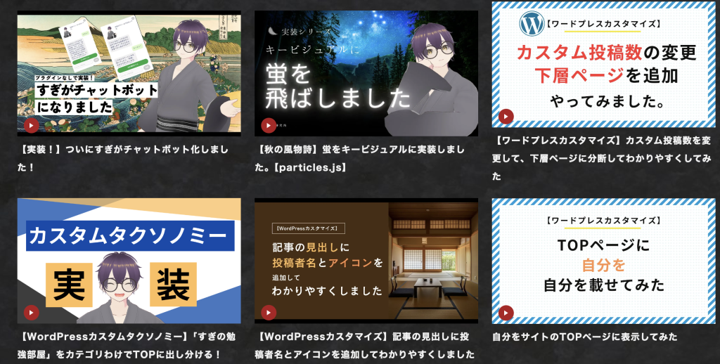
みなさんこんにちは、すぎです!
前回はYouTubeの箇所をiframeからアイキャッチ画像に変更しました。
それに伴い記事との見た目の差異がほとんどなくなりました。
今回はYouTube箇所をわかりやすくするため、少し追加で変更を加えました。
記事の見た目との差異をつけるため、
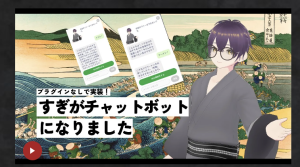
①見出しにYouTubeアイコンを追加
②画像に再生ボタンを追加
をし、さらに視覚的にわけます。
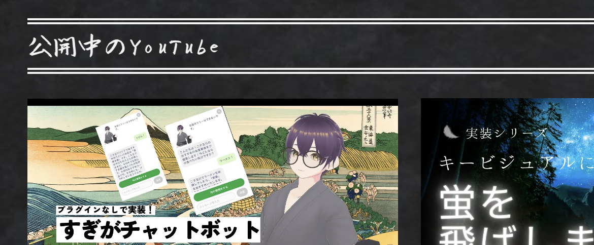
①についてはYouTubeのアイコンを追加します。
before
<h2 class="top__title">公開中のYouTube</h2>after
(php)
<h2 class="top__title">公開中のYouTube<img class="icon" src="https://kotobukilab.com/media/wp-content/uploads/2024/10/youtube.png" alt=""></h2>(css)
h2.top__title img.icon {
	width: 45px;
	margin-left: 10px;
	display: flex;
	align-items: center;
	justify-content: center;
}
画像を追加し、さらにサイズを調整するためのcssを追加しました。
②さらにわかりやすくするため、下記のように画像に再生ボタンを追加します。
<div class=”circle”></div>
を追加し、cssで再生ボタンを作っていきます。
before
<li>
<a target="_blank" href="<?php the_field('link'); ?>">
<img src="<?php the_field('thumbnail'); ?>" alt="<?php the_title(); ?>のアイキャッチ画像">
<h2><?php the_title(); ?></h2>
</a>
</li>
after
(php)
<li>
<a target="_blank" href="<?php the_field('link'); ?>">
<img src="<?php the_field('thumbnail'); ?>" alt="<?php the_title(); ?>のアイキャッチ画像">
<h2><?php the_title(); ?></h2>
<div class="circle"></div>
</a>
</li>
(css)
.youtube_wrapper li {
	position: relative;
}

.circle {
	width: 24px;
	height: 24px;
	background-color: #b11920;
	border-radius: 50%;
	position: absolute;
	top: -15px;
	left: 10px;
}

.circle::before {
	content: '';
	position: absolute;
	left: 50%;
	top: 50%;
	transform: translate(-50%, -50%);
	width: 0;
	height: 0;
	border-left: 6px solid white;
	border-top: 4px solid transparent;
	border-bottom: 4px solid transparent;
}
実装できました。
次回はYouTubeのクリック先の実装をしていきます。
ここまでお読みいただきありがとうございました。